Elevate Your Digital Presence
We design and construct breathtaking, performance-driven digital interfaces that bring your web products to life.

We design and construct breathtaking, performance-driven digital interfaces that bring your web products to life.
A fusion of structure, material, and motion into a premium, responsive website framework.
Streamline complex workflows, orchestrate multi-agent operations, and automate repetitive tasks with custom logic layers built for speed.
Experience the web in real-time. Responsive hover states, frosted glass textures, custom pointer alignment, and buttery smooth transitions that keep users deeply engaged.
Optimized for page speed and excellent Core Web Vitals to keep LCP scores low and user retention high.
Robust security configurations and protocols protecting user privacy and data integrity.
Stunning, asymmetrical layouts structured around clean vertical grids and Outfit typography. Perfect scaling across both desktop monitors and cellphones.
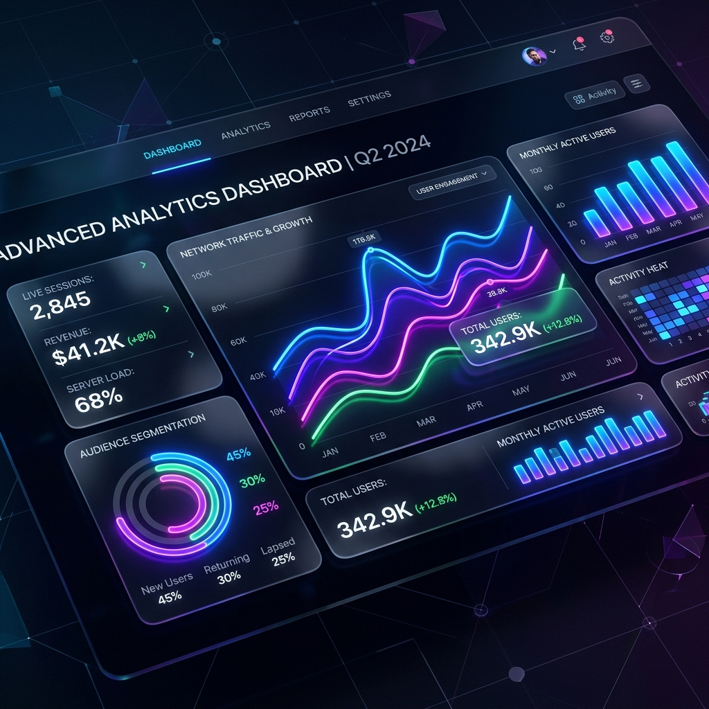
Take command of our performance console. Switch between analytics views, automate workflows, and inspect live security telemetry.
> Workflow initialized: optimize-assets. Auto-minifying SVG lines...
From initial design system discovery to a fully optimized, responsive deployment pipeline.
We curate harmonized color palettes, modern typography, and interactive cursor properties tailored strictly to your brand aesthetic.
Constructing asymmetrical grid layouts using pure HTML/CSS. Responsive components adapt natively to desktop monitors and cellphones alike.
We inject micro-animations, theme toggles, and scroll reveals, then tune LCP and Core Web Vitals to guarantee blazing fast performance.

Real feedback from businesses powered by our digital infrastructure.
"The team at aia.netsite.ai transformed our online presence. Their design work is exceptional, and the performance boost was immediate!"

"Professional, responsive, and truly understood our vision. We couldn't be happier with the results from aia.netsite.ai."

"From concept to launch, aia.netsite.ai delivered beyond expectations. A truly collaborative and expert partner."

Select the plan that fits your digital growth. Save 20% on annual billing commitments.
Perfect for basic product landing pages.
Designed for premium, high-impact branding.
For custom digital hubs and full operations.
Everything you need to know about our modern frontend interfaces and design principles.
A Bento layout is inspired by the structured compartments of Japanese bento boxes. It organizes content into asymmetric, grid-like sections with different column and row spans. This offers a premium, modern design aesthetic while remaining perfectly responsive across viewport widths.
No, the inertial custom cursor is strictly optimized for hover-enabled devices (desktops/laptops). It is automatically disabled on touch devices using CSS media queries (@media (pointer: fine)) to prevent gesture conflicts and preserve performance on mobile viewports.
We build our pages using vanilla HTML/CSS and vanilla JS, completely avoiding heavy frameworks. We utilize lazy loading for media assets, optimize font delivery formats, and employ deferred rendering (using CSS content-visibility) to keep Largest Contentful Paint (LCP) times extremely low.
Yes, we feature a unified light/dark mode theme toggle at the top navigation bar. It dynamically shifts color variables using CSS custom variables with fluid transition curves. The user's preference is also saved locally via browser storage to persist across future visits.
Let's discuss how we can elevate your tech product with beautiful, responsive frontend architecture.
Contact Us Now